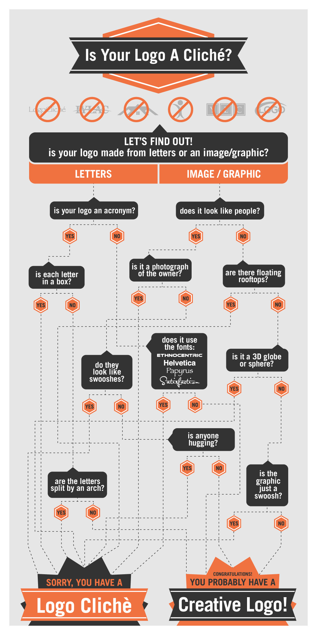
They say that you only get one chance to make a first impression, and for many businesses that first chance is their logo. No one wants a forgettable, monotonous logo design. Yet there are countless businesses that use the same old tired logo clichés to represent them. You know what I’m talking about: a realty company with floating rooftops, abstract people made from swooshes and a ball, putting initials each in their own fancy looking box, using the font Papyrus or Satisfaction. These are a few of the most common logo clichés.
This infographic will take you through a series of yes/no questions to determine if your logo has any of these offenders. For your sake I hope your logo doesn’t. But if it does, I strongly encourage you to consider updating, revising, or obtaining a new logo altogether. It will help your business stand out from the crowd, making a more impactful impression on your target audience. If you need help finding graphic designers I can recommend www.48hourslogo.com. They have an amazing design community that can produce an original, creative logo design for just for you. With that in mind, good luck following through this infographic, I hope you enjoy it!
